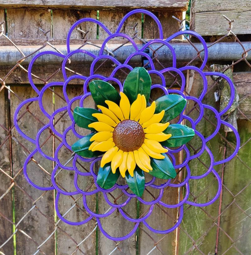
@UrbanWild, it took me awhile to recall those old 4H leader days, but some of those basic "design principles" from the Extension service have come back to me. So, black would be for negative space, and useful if you want the sunflower to be the main focus of the piece. Same would be true for the rust and brown tones, as they would blend in with the background. Purple is the complimentary color for yellow, so you can't go wrong with it. It would make the scrollwork stand out better, without taking too much focus away from the sunflower. Black and purple, therefore, are "safe" choices. But rules are meant to be broken, and if you don't like the result, you can just repaint it.