Interesting!
For the record: I didn't actually bring up any points--Asa just borrowed my picture.
And it is a great (although extreme) example of an image that I didn't put into the photo contest and wouldn't put into the database precisely because of the thumbnail.
And, I also agree with the points that they, Asa and William, brought up, plus I have a few of my own.
The centered, square crop can be such a horrendous representation of the full image and nowhere is this more apparent than in the site banners forum! There are many hideous thumbnails of glorious banners on display there.
It is probably easier to get an idea of the basic color or gist of the thing with the square though because a tiny little stripe as the thumbnail would be indecipherable. And as sooby points out, on a phone, forget it!
However, I am quite certain that the thumbnails as displayed for review and selection or exclusion by admin are represented larger and with the correct aspect ratio because it is necessary to view them that way given their shape and purpose.
And, of course it would be possible to redesign how they are displayed in that forum, but is that necessary? IDK, for our collective in-house purposes, probably not

In pondering this, I came to the conclusion that if,
for example,
google image search or my own image files--when set to display icons--presented me with uniform, square centered crops of every image
that would be really aggravating to me and NOT useful.
As an aside--thankfully, google images does display many ATP images with the correct aspect ratio, but did you know that google images also displays a ton of the 'ATP crop' too? which is not 'clickable' to view corrected? That may or may not be a downside depending on the image and so many other things from the viewers' perspective. But if you want to see ruined images, just do a google image search for ATP banners and check out the 250 x 250

that comes up!
I really don't know how important it is to consider what ATP provides to the search engines and web crawlers. I do know that if I search for images from NARGS, for example, which is another gardening site that happens to have lots and lots of photos, the images that come up are not ever poorly cropped by artificial construct because the site doesn't do that. Personally, I wish this site didn't either and I'd prefer not to see the 'bad' crops, on google pages, from ATP at all, but especially when they're mine :blushing:
I really don't like to see them here either:
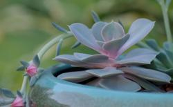
The only saving grace is that here the images are clickable and I love the fact that there is not a cap on the height!
and I am a clicker and scroller

I totally get that this is not a photo site and that the default thumbnail dictates.
I still submit a few bad thumbnails cuz I like the photo if you click it and some people do click on them.
Mostly though, I don't submit them.


