Here's the deal with stuff like this on a site like this:
1. Dave's site, Dave's calls on things.
2. It's a crowd-sourced site. That means that the site owner depends on the participants for content.
So a tacit contract or implied covenant is in play. Specifically, the content providers (the rabble like you and me) get to provide content and make suggestions to better our community and to tune things where we think they can be improved. That's our half of the bargain. Dave's half of the bargain is that he gets to reject or accept the tunings (for whatever reasons he has - practical, aesthectic, personal, vision, whatever, etc.).
That's part of the deal that the site owner makes with the content providers on a crowd-sourced site. So we, the rabble, have a stake in the site and an interest in the site - and make suggestions from time to time. Nature of this particular beast. And, necessarily, some of the discussions will be more esoteric than others. We all have our interests and areas of expertise.
This particular conversation is about how photos are displayed. It is, as Greene points out, rather immaterial or uninteresting to perhaps the majority of the members. But that doesn't mean that it's not significant nor worthy of discussion. Crowdsourced sites leverage the expertise of the contributors - so don't be quick to knock something that falls out of William's brain. He knows a thing or two about photos, aesthetics, and presentation.
Historically Dave's been really amenable to practical suggestions. And, not to put words in his mouth, but I've seen him implement several suggestions that people have made.
Whether anything comes of it, this conversation on the aspect ratio of the thumbnails is both interesting and useful. And something worthy of discussion for a lot of reasons - both internally (to the site itself) and externally (how the site and its contents is displayed in search engines). The discussion is not a condemnation. It's a tuning suggestion. And, all things equal, those in charge of stuff welcome suggestions (as does Dave) - and they consider them - and choose to implement them or not. Something as elegant as this site doesn't fall out of a single brain.
------------------------------------------------
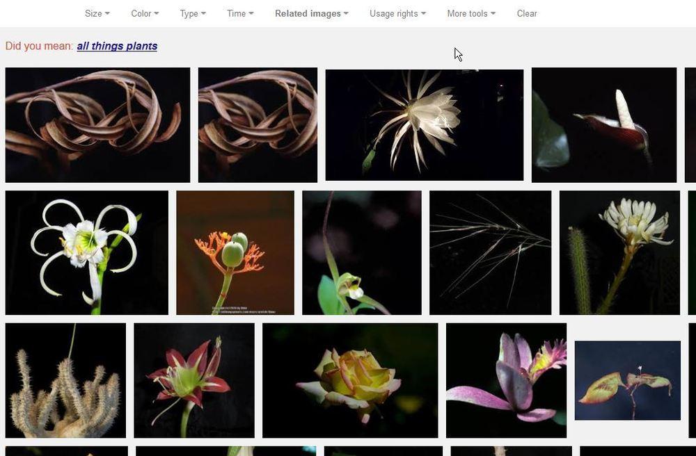
So.....................in continuance of the conversation - and to make a point that dirt brought up to me - this is also something to consider with the thumbnails: ATP photos show up on Google (and other search engines') image search. Not just the photos that we upload to the database, but the thumbnail crops as well. Here's a GIS that I did for ATP. Turns out that my photo of dead willow leaves shows up first - with its thumbnail trailing it (google displays differently for everyone depending on your history, btw, so your results will necessarily vary):
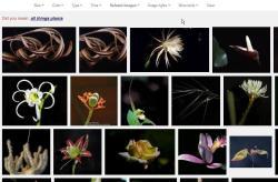
Relative to the pictures, I see three pretty dumb thumbnails that really look pretty bad and represent neither the pictures nor the site well. They follow:


I know there's been some reluctance in this thread about "whitespace" and borders - but...I think that's been misunderstood.
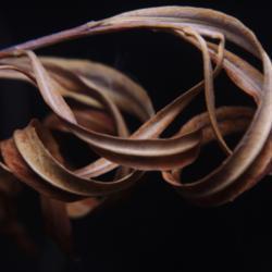
SO...were the aspect ratio preserved, this is what the thumbnails WOULD look like in a GIS (top row proposed vs. bottom row now):
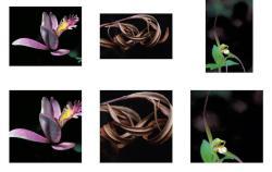
Notice that you can actually see the photo, they're still displayed in a square/grid, the whitespace is not bordered, and the composition isn't screwy.
None of these are particularly good photos. But they're the ones that showed up first in my GIS as examples. I can find many, many more if anyone is interested - and I'm pretty certain that I can find much more egregious examples.
Sorry for all the words. The point of the 2nd half of this post is: the square cut in making thumbnails shows up in image searches - and doesn't necessarily put the site's best foot forward.
--------------------
Finally, to the question of coding: I'm not a coder either, but I've done a good bit of web development. The customizable idea that William had would be really complicated. Shrinking the photo to 250pixels (or whatever) max width/height would be no more complicated than cutting a square out of the middle (arguably less so). So as far as the coding goes, I'm guessing that's a non-factor in preserving the aspect ratio. In my mind, it comes down to tradition (this is the way we do things here) and taste.
I brought up the image search notion because I think it's an unintended (and unconsidered) byproduct of the square chop.