OK, here you go. A short 'color' tutorial to help with using those luscious colors you love together.
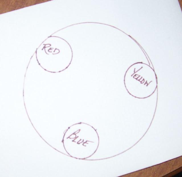
Here's the color wheel, it has only the primary colors on it, red, yellow and blue. Those are colors that you must have to start with, you can't mix to get them. That's why they're called primary colors:

Then going from one primary color to the next, you'll get the secondary colors by mixing the two together:
Blue + yellow = green
Yellow + red = orange
Red + blue = purple
So here's the color wheel with both primary and secondary colors in their proper places:

Now, colors that are directly across from each other are called 'complementary colors'. That doesn't mean they go well together as in dressing, in other words you wouldn't wear a red skirt with a bright green sweater. But think about Christmas, red and green go well together because they make each other pop. So they complement each other. Here are the complementary colors:

When you are doing things like the chairs, you can choose your main color, like green, then you can go to the color wheel and choose a shade of red that will complement it. In this case of my green barstool, I used a reddish purple. It would also have worked if I'd just used red, and I did use a touch or two of red in the pansies. So that's how I know the colors will do what I want them to do.
Same with the orange chair. Blue is the opposite of orange on the color wheel so I chose shades of blue to make it pop.
You can also use small amounts of other colors too. On the orange chair you'll see some dark blue and some lime green.
On the barstool you'll see all the pansy colors then a touch of dark green with the touches of purple.
If I were to do a yellow chair, I'd be sure to use purple, a really good purple, not necessarily one with red in it.
Does this help?
If I do a blue chair, then orange and all it's yellowy shades would be my pop color.
If I did a red chair, chances are I'd use a lot of lime green, maybe bright greens to make it pop.
As long as you don't use two primaries together in equal amounts, you are safe. Same with using secondaries together.
So a primary with a touch of secondary for accent is what you go for. Or a secondary with a touch of a primary.
Shades don't matter much, they count as the main color, like pink counts as red, so does fuschia.
And apricot counts as orange.
Does that help? Maybe a little??
It's the small amounts of the pop color that matters.