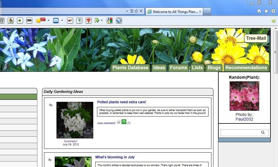
I have redone the way the tabs up top are done. I moved the Profile and Mail tabs off into buttons by themselves at the very top-right. This made room for the Recommendations tab.
At some point I'd like to rethink the entire way I'm doing the tabs up top. I think what we have is a design that is an old and tired navigation method but it's the only way I've ever really known how to do navigation which is why we have it the way we do. At some point I'd like to tidy it up even further.
Dutchlady1 said:Oh, and where did the plant database go?
It's still there Hetty. It just says "Plants" now instead of Plant database.
I like the profile & treemail buttons not in the line of the other buttons but agree with Hetty on them sort of interference with the banner pretties.
LOVE the idea of re-working the whole thing Dave. I have no suggestions so will leave that to your fruitful mind.
I am a strong believer in the simple fact is that what matters in this life is how we treat others. I think that's what living is all about. Not what I've done in my life but how I've treated others. ~~ Sharon Brown
Name: Rick Corey Everett WA 98204 (Zone 8a) Sunset Zone 5. Koppen Csb. Eco 2f
I like a big panel of buttons up fornt to take me where I want to go in one step.
Maybe a whizzier scheme would hide all the buttons behind one "navigation" icon, and when the mouse approachs the icon, a biog navigation panel pops up. That way it is still only olne lc ick, but leaves more room fopr the pretty banner photos.
That's my second criterion: close to my first. See more of the banner!
I don't think the profile and tree-mail distracts from the banner but should you change your mind, could they go down below in the footer? Once folks know where they are, I don't think it would matter. Or maybe just the profile in the footer. Not a suggestion, just thinking out loud.
I do wish you had room to get the word database back in though.
Name: Marilyn Greenwood Village, CO (Zone 5b) Garden today. Clean next week.
with what has been said.
What if you changed recommendations to I Like. And give catergories of Online, Local, and specialty nurseries. Their might be other types of retailers major and cubits that we could like as well.
Name: Marilyn Greenwood Village, CO (Zone 5b) Garden today. Clean next week.
I wouldn't mind if the banner was slightly larger... I do love all the creativity that goes into the banners. You could then move the banner pictures slightly to the left, even behind the logo?
Could you make the Mail and Profile buttons transparent? If you could see the banner through the background of the buttons, they wouldn't detract so much. I'm not sure that Profile is important or used often enough to be up there in a button, Mail I agree with.
Name: Evan Pioneer Valley south, MA, USA (Zone 6a)
Dave,
How many tabs do you envision eventually?
How about a graphic (like the badges) plus text for each tab, set as default? Provide a profile option for no text display. Maybe even small or large display like with web browser buttons (or is that Windows buttons)?
Name: Michele Roth N.E. Indiana - Zone 5b, and F (Zone 9b) I'm always on my way out the door..
Could the tree-mail tab still be green until it's prompted to go red by a new reply? Purely aesthetics, I know, but it looks nice when they're all the same color.