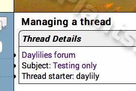
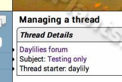
found this in the moderator area of a thread I made. The bullets are cut off.
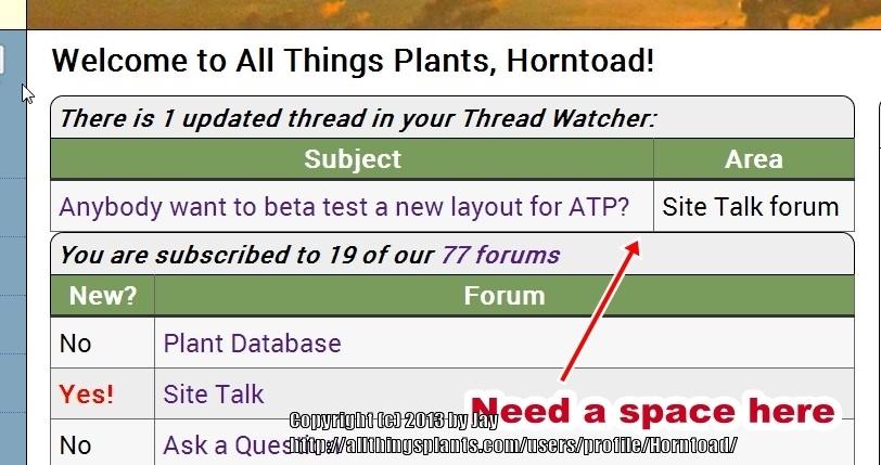
I miss the floating bar. Having all those items lined up on the left takes up to much vertical space, meaning that the other items, like links, and the moderator items when they are shown, are farther down.
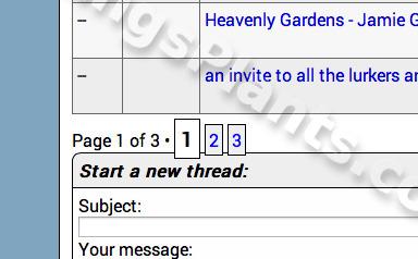
I don't mind the column on the left, instead of the right, but the way it is set up does not seem as convienient. Maybe it is because I was so used to the floating bar. That was unique to ATP, and I liked it a lot. Even though it didn't work so well sometimes on the iPad or iPod. It was also really great on the iPad too - because I can't command UP or DOWN on there. I keep my posts set to show 500. If I am on the iPad, and I want to make a new thread in the daylily forum, I have to scroll a LONG time to get to the bottom where the new thread area is. Or, if I was way down in one of the Porch Swing threads, I could just pop up there to the floating bar and hit the mail, or home or DL DB (daylily database) buttons.